July 23, 2020
Colour 101 For Developers
I've been working on a brand new update for my personal site recently, seanbailey.dev, and part of that process involves trawling through old projects, screenshots, videos, and sketches, to try and develop a coherent portfolio. This provides a fantastic opportunity to reflect on my progress as a designer, and I think the area this is most evident, is in my use of colour.
As a slightly colour blind software developer, learning to make the most of colour has always been challenging. I figure there must be at least a few other developers out there experiencing the same difficulty, so I'd like to share some lessons I've learnt over the course of my relatively short career.
Improve Your Quality of Life With HSL
A lot of developers fall for the common mistake of formatting their colours in
hexadecimal (e.g. #FFFFFF). Hex is a great format for sharing shades, and is
pretty much universally understood by creative software tools and websites. But
the thing about Hex is that it's difficult for our primate brains to comprehend,
because it's based around red, green, and blue.
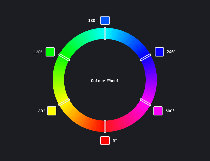
HSL however, is far more intuitive. It's composed of three observable properties of colour: hue, saturation, and lightness. You can think of hue as the base colour of your shade. It's actually a measure of rotation around a colour wheel (pictured below), so you typically express hue in degrees or radians. When working with HSL, you can easily change the base of a colour by rotating the hue a few degrees. Try doing that with hex!
Saturation measures a colour's intensity. A more saturated colour is more vibrant. A less saturated colour moves closer to greyscale. You can use this to your advantage to create vibrant colours that should draw attention, or faded colours that should retreat into the background.
Be careful not to go too crazy with the saturation! You may find your design becomes visually noisy, which is quite an unpleasant experience. Instead, use saturation as a tool for creating hierarchy in your content.
Lightness, as you might expect, describes how much light is reflected from the colour. By cranking the lightness to 100% you get white, and turning it down to 0% gives you black.
Use Colour Palettes to Maximise Consistency
Another common mistake made by developers, is choosing one or two colours and then manipulating them as needed. The problem with this approach, is that when your interface starts growing, you start getting 30 to 40 different shades of the same colour, and things start to look a bit inconsistent. Remember! Consistency is essential in interface design.
Instead, take some time to create a colour palette before you add any colours to your interface. It can be a time consuming process, but having a finite number of shades will really make your interface feel more designed. There are loads of tools out there to help you with this process.
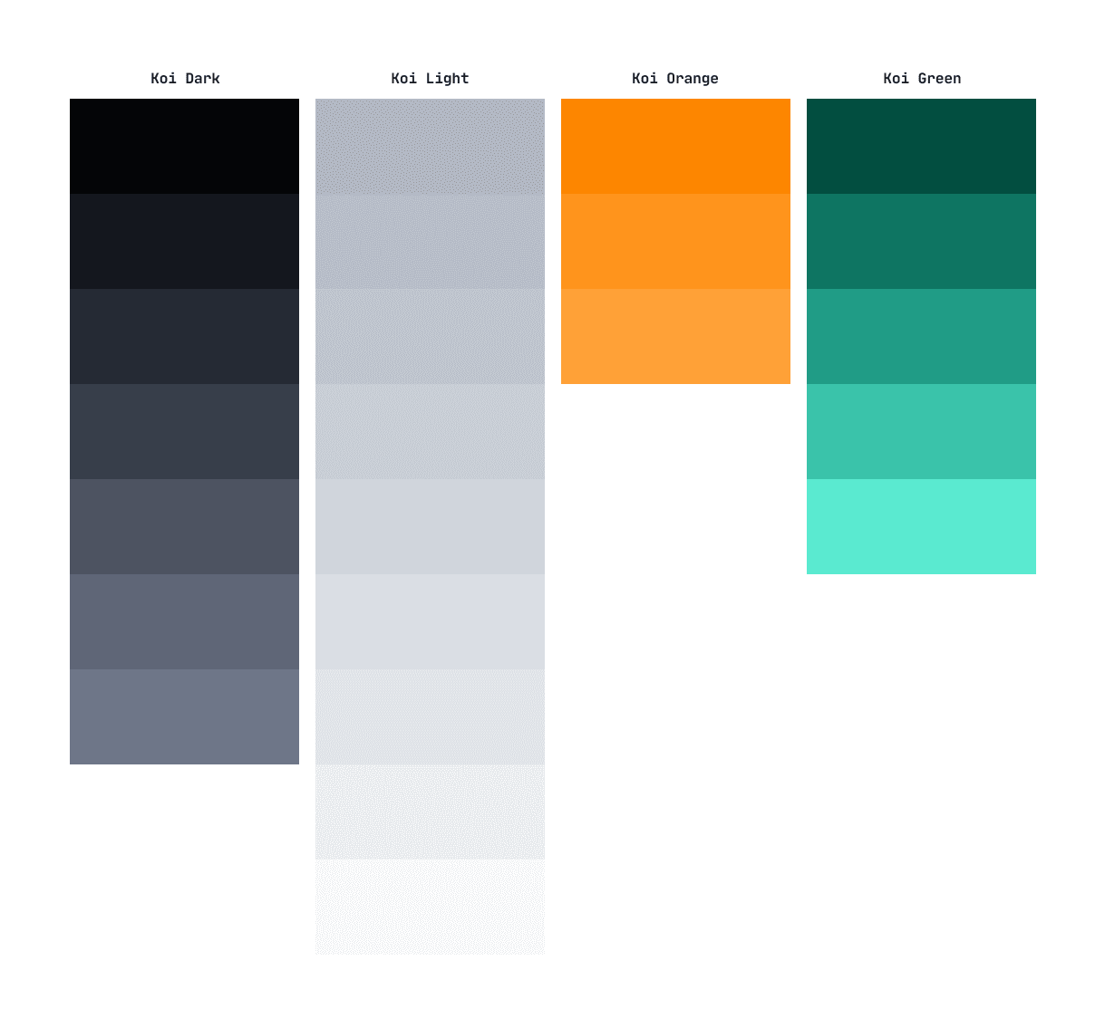
Here's a sample colour palette that I created for a previous project, Koi. You should probably develop your own method for creating palettes, but here's a rough rundown of my approach:
Choose some base hues. I typically choose one primary hue, one hue for my background shades, and a few utility hues for things like danger, success, and warning.
Pick some shades. Sometimes I use tools like palettte.app to help with this process, but doing things by eye is usually better than trying to find some mathematically perfect shade. You'll likely want more shades for your greys, all the way from dark to light, and only a few shades for your primary and utility colours.
Iterate! The only way to create a great colour palette is to actually try it out. I often take 10 to 15 stabs at colours before I get something I'm happy with, and continue to tweak them in future when I think I can make slight improvements.
Test on Many Different Screens
As you know, there are thousands of different screens and device types out there, and each display colour in a slightly different way. To make it even more difficult, lighting conditions in the viewers room, and differences in colour perception between individuals, can really mess up your hand crafted colour palettes. As if working with colour wasn't hard enough already.
To help minimise the variation of my colour palettes, I always try to design on the most colour accurate monitor available to me. You can also use Windows' or Mac's built in colour calibration wizards. These tools well help make sure your monitor settings are as correct as they can be.
And as the title of this section suggests, you should also try your designs in as many different conditions as possible. You may find that your text colour is no longer accessible when the display is exposed to bright sunlight, or that the boundary between two sections is invisible on cheap monitors.
Now go out into the world and add some colour!
Thanks for reading
If you liked that article, why not subscribe to my mailing list? I write about software engineering, product design and more!
100% spam and tracker free!
Cover image by Jason Leung


